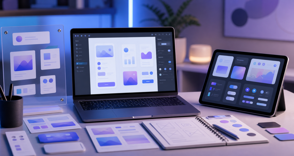
Apple has made the iOS 27 design kits available as part of its updated Apple Design Resources, giving app developers and designers a clearer starting point for building interfaces around iOS 27, iPadOS 27 and macOS 27. The official Apple Developer news post says the design kits are now available for both Figma and Sketch.
This is useful beyond the design community. When Apple updates its design resources, it often signals how apps will start to look and behave across iPhone, iPad and Mac over the next year. For everyday users, that can mean more consistent controls, better dark mode support and app interfaces that feel more at home on the latest Apple software.
What are the iOS 27 design kits?
The iOS 27 design kits are official Apple templates and UI resources for designers and developers. They provide interface components, layout patterns and visual guidance that help teams design apps before writing every screen from scratch.
Apple’s Developer news announcement says design kits for iOS, iPadOS and macOS 27 are now available for Figma and Sketch. Apple also maintains a broader Apple Design Resources page with templates, icon production resources, colour guides and platform-specific downloads.
Why this matters for Apple users
Most iPhone and Mac users will never download a Figma file, but they will feel the results. Developers use these design kits to make app screens match Apple’s platform conventions. That helps buttons, navigation, menus, sheets and settings screens feel familiar across different apps.
Good design resources also reduce guesswork. Instead of each team interpreting Apple’s new interface direction differently, designers can start from the same official components. The result should be apps that are easier to learn and less visually inconsistent after major software releases.
Key changes in Apple’s new design kits
Apple lists several important updates in the new kits. These include updates to Liquid Glass, expanded component and state support, naming changes that better align with code, improved resizing and the addition of Dark Mode support for macOS.
Updates to Liquid Glass
Liquid Glass is part of Apple’s newer visual direction, with translucent surfaces and layered interface elements. Updated design kit components help designers understand how those surfaces should behave instead of relying only on screenshots from presentations or beta software.
Expanded components and states
Components are reusable interface pieces such as buttons, lists, fields, toggles and panels. States describe how those components appear when selected, disabled, focused or pressed. Expanded state support is important because real apps are full of edge cases, not just perfect marketing screens.
Naming that better matches code
Apple says the kits include naming changes to better align with code. That may sound small, but it can help designers and developers communicate more clearly. When a design component name matches the language engineers see in SwiftUI, AppKit or UIKit workflows, handoff becomes smoother.
Improved resizing and Dark Mode support
Improved resizing helps teams design layouts for different screen sizes, from compact iPhone displays to larger iPad and Mac windows. Apple also mentions Dark Mode for macOS, which should help Mac app designers test interface contrast and readability earlier in the process.
How developers and designers can use the kits
The practical use case is straightforward: start new app screens with Apple’s official components, then adapt them to your product. This is especially helpful for teams preparing updates around iOS 27, iPadOS 27 or macOS 27 while the platform design language is still settling.
Designers working in Figma can use the kits for wireframes, prototypes and design systems. Sketch users get a similar benefit if their workflow is built around Sketch documents. Developers can use the files as a reference when checking spacing, hierarchy, control states and platform consistency.
What this means for iPhone, iPad and Mac apps
For iPhone users, the update should encourage apps that feel more aligned with iOS 27 controls and navigation. For iPad users, design kits are particularly useful because iPad apps need to work across touch input, multitasking, landscape layouts and sometimes keyboard or pointer use.
For Mac users, macOS 27 resources can help developers refine desktop-style layouts while still fitting Apple’s current design direction. If you are following Apple’s upcoming software changes, our recent guide on the ImageCreator class discontinued in iOS 27 is another developer-focused change worth reading.
Should app teams take action now?
Yes, especially if an app is planning a major iOS 27, iPadOS 27 or macOS 27 refresh. Teams should download the official resources, compare existing app screens with Apple’s updated components and review whether their design system needs changes before the next public software cycle.
This does not mean every app should be redesigned immediately. A rushed redesign can be worse than a dated but usable interface. The better approach is to audit key screens, update reusable components, test light and dark appearances, and make sure changes support usability rather than just visual novelty.
Final thoughts
The iOS 27 design kits are a practical release for developers, designers and product teams preparing for Apple’s next platform generation. They give teams official guidance on Liquid Glass, components, resizing, naming and macOS Dark Mode support.
For users, the impact will appear gradually as apps adopt the updated patterns. For app makers, now is the right time to review Apple’s resources and plan thoughtful updates rather than waiting until the last minute.
FAQs
Are the iOS 27 design kits official?
Yes. Apple announced the iOS, iPadOS and macOS 27 design kits through Apple Developer and hosts design resources on its official developer website.
Do the kits support Figma and Sketch?
Apple says the updated design kits are available for both Figma and Sketch.
What is Liquid Glass?
Liquid Glass refers to Apple’s newer interface style using layered, translucent and glass-like visual elements. The design kits include updates related to this design direction.
Do everyday iPhone users need to download these files?
No. These resources are mainly for designers and developers, but users may benefit when apps become more consistent and easier to use.
Where can developers get the resources?
Developers and designers can start from Apple’s official Design Resources page.
Leave a Reply